

I used this image for my cover page, but decided that it looked too dull and not vibrant enough for a cover image. Therefore on Photoshop I edited this image so make it look like this ->
By changing the levels I made the background appear more black and changing the contrast made the picture look more colourful. This made the overall cover image look more attractive to its audience.


I used a variety of images on my front cover so I needed to make sure they looked professional. For this image, I decided to again change the levels to make the background look more black and then I adjusted the contrast to bring out the bright colours such as red. To make the picture stand out from my cover image, I added a blue border to it, to contrast with the dark colours of the cover image. Then I added a shadow to add some depth to the image. The transformation can be seen in this picture ->
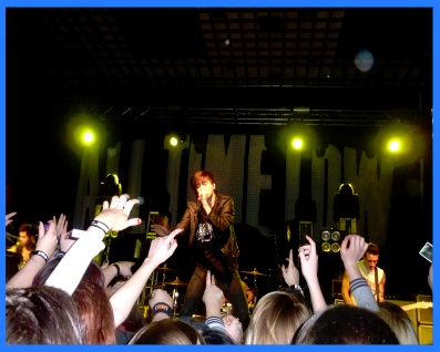

I did the same to the other pictures I used on my magazine cover which can be seen here..

 For this image, I cropped out the unecessary space on the left side of the image. I then changed the levels, the contrast and the brightness level to make the picture not seem dull. I added a glow to this image to set it apart from the rest and achieved this by employing a different border colour.

On my contents page, because I wanted to keep the focus on the information on the page, I decided that having colourful images would distract the reader from what I want them to see. Therefore, I changed all my images on my contents to black and white on Photoshop like this ->


I did the same to the other pictures I used on my magazine contents which can be seen here..


I used this picture on my double page spread as the main focus for the article. I wanted the picture to look attractive because the article is based on the band in this picture. Therefore, I adjusted the levels to make the black and red colours in the image stand out more and make it look more professional than it originally looked.

 I also used this picture on my double page spread on the article side. I decided that I didn't want to take the focus away from the information so i changed the picture effect to black and white. I didn't want the page to look too dull though so to fit in with the colour scheme I added a purple glow to it.
No comments:
Post a Comment