Friday, 30 December 2011
Wednesday, 28 December 2011
Questionnaire Results

This graph shows the top 10 results of the question, what words do you associate with rock music. I asked this question so that when i design my magazine, i know what kind of things to include that will appeal to the audience. For example, because the highest response was guitars, i know to include guitars in my design.


I asked the question, what do you like about magazines because i want to include content and have a design that people will be interested in. So by having informative content and pictures, that will be the best design and layout for my magazine.

In addition to this, i also asked what do you dislike about magazines so i know what to avoid when i come to designing and structuring the content for my magazine. My results show me that i must avoid including too much information and advertisements.

I wanted to have an idea what my target audience liked about designs so i compared the three magazines, NME, VIBE and Kerrang! and asked which design they liked the best. The highest result was NME, so i now know when creating my magazine i should base my design on NME the magazine because that is what is most popular.

This question is another question based on design and appearance. I asked which font they liked the best so that i knew how to style the writing included in the magazine as well as the rest of the layout. My results show me that both fonts 1 and 2 were really popular.
I did two more questions to find out more information so that i could create a good magazine. One question was whether incentives would persuade you to buy a magazine, the results i got back were Yes (24) No (7). This shows me that i should include incentives in my magazine because it would persuade more of my target audience to buy it. I also asked the question, Would information on upcoming concerts interest you? To which i got the results Yes (28) No (3) which tells me that if i include a gig guide in my magazine, then it will be really popular with my target audience.

Monday, 26 December 2011
Planning production
Price: My questionnaire results show my that the appropriate price for my target audience is between £1-2. Therefore I decided to go halfway and have £1.50.
Frequency of publication: My target audience appears to not buy magazines as often as every week, therefore i have decided that the frequence of publication will be every month.
Average issue size: Other rock magazines have a range of issue sizes. This depends on the frequency of the publication. As the monthly magazines are 100+ pages, i have decided to have 100 pages.
Regular content: The regular content that will be in my magazine will include Pop-rock bands. This is because it fits in with my genre of rock music.
Feature Articles: The magazine will have feature articles such as Band of the week, New music and Gig reviews. This is because these type of things appear more interesting to my target audience. As i found out from my questionnaire.
Title: I have decided that the title of my magazine will be Soundcheck. I think that it sounds most appropriate for my genre of magazine and for the target audience.
Thursday, 22 December 2011
NME Review - Article Research
 This is a music magazine which mainly focuses on indie music. The layout of the magazine consists of the cover stars as a background and then images overlayed on the top. The masthead appears below the centre of the magazine as main coverstars are in the center.The magazine title ‘NME’ appears boldly at the top of the page, because it is in capitals and bold, red text it contrasts with the colour scheme for the rest of the cover. I think that it has been designed this way so that it is clearly seen and is instantly recognised as the magazine name.
The main story in this magazine about The Wombats.This is recognised as the main feature story because the font is big, bold and stands out from the rest of the stories around the page. The colours used are quite bright and bold, this again catches the eye and stands out. The yellow text is significant because it stands out from the rest of the story and gives the reader a quick insite as to what it is about. Also the text is quite spaced out on the story so that it takes up more of the front cover space than the rest over the stories.This is another indication that it is the main story in the magaine.
This magazine also includes other feature stories around the page. This intrigues the reader as there is more information about the content so therefore makes them more likely to buy it. Usually magazines have incentives which also make the reader more likely to buy it, however this magazine doesn’t. Instead, it advertises upcoming events such as Glastonbury, which would interest the reader into buying it. The significance of the event being in the banner of the cover is because it will appeal to a wider audience and therefore more people will be interested in it. The way that some of the sub features include quotes such as, ‘I was sick before going onstage at Wembley’ show how the designer has thought about what the reader would see at first glance. This technique makes the reader want to read the rest of the story and therefore want the magazine. At the footer of the magazine, there is a barcode. This is usually placed at the bottom of a magazine because it is most convenient.
The design is rather simple, and therefore can be easily recreated onto Photoshop. By putting all of the images in different layers and then correspond them to the order they overlap in the magazine, it will create the overall layout for the magazine. By using the ‘rectangular marquee tool’ it is easy to recreate the banners on the cover by selecting the colour necessary. Then by using the ‘text tool’ it is easy to add the corresponding information onto the cover. By adding a ‘stroke’ to the title ‘NME’, it is easy to have the black outline on the text by going through ‘blending options’. Furthermore, by using the ‘move tool’ it is able to select text and change the angle of it.
Monday, 19 December 2011
Reviews on Double Page Spreads - Article Research

This is a double page spread on the band Florence and the Machine. This story featured in the magazine NME, which is based around indie artists. The design has been structured so that the left hand side is all one image and the right side includes the main body text. There is an overlay of text for the main title “USA got the love.” To put emphasis on the word USA, it has been put in bold so even though it is behind the music artist, it is still clearly visible. For the words “got the love”, as it is a reference to one of the bands songs, it has been placed as an overlay, in black, a different font and in italics which suggests that it is considered more important. The design of the main body text has been structured clearly into 3 columns to keep the information neat and easy to read. Also above the third column there is a reference to the writer and the photographer who took the feature image. The music artist has been positioned on the left side because then there is more room for information and it is eye catching to the reader. However, I think that there should be an image or images to break up all the information in the main body text because otherwise it looks too much.
There is a colour scheme throughout the double page spread of red, white, black and grey. By using this colour scheme, the magazine avoids all elements of making it look tacky and unprofessional. Above the main body text there is a small paragraph of information which makes the reader want to read the rest of the article. The colours in this paragraph include blue which completely stands out from the rest of the colour scheme and draws the reader’s eyes to it. The editor of the magazine has included a drop cap at the beginning of the main body text. The drop cap is in a different font and size from the rest of the text so therefore stands out as the rest of the text is much small. The use of the drop capital states clearly where the beginning of the article starts. The design for this article is very plain and simple. I think that the editor and designer wanted to make the image look classy and sophisticated. Overall, the two pages aren’t very busy and are in fact quite spacious because there is a lot of free space around the page. An example of this is in the top right hand corner where the text overlays. To make this page better I think that more could be added to the design, because there is only one picture and then text. I think if there were more images then the two pages would look more appealing to the viewer.

There is a colour scheme throughout the double page spread is a mixture of different tones of blue, white and yellow. By using this colour scheme, there is a clear divide between the background image and the information on the pages. Above the main body text there is a small subheading which reads “The Famous Five” which has the aim to make the reader want to read the rest of the article. The colours in the main body text include black with a white block background which completely stands out from the rest of the main body text and draws the readers eyes to it. The editor of the magazine has included a drop cap at the beginning of the main body text. The drop cap is in a different font and size from the rest of the text so therefore stands out as the rest of the text is much small. The use of the drop capital states clearly where the beginning of the article starts. The design for this article is very plain and simple. I think that the editor and designer wanted to make the image look intriguing and brief. Overall, the two pages aren’t very busy and are in fact quite spacious because there is a lot of free space around the page. An example of this is the left page where there is only the background image and a little bit of text. To make this double page spread better, I think that there should be less information on the right side and more on the information on the left so that it evens out the information so there isn’t so much.

Thursday, 15 December 2011


Monday, 12 December 2011


Sunday, 11 December 2011


Friday, 9 December 2011
Draft of Original Article
The Soundcheck Awards featured many bands this year, and one of those bands included the newcomers Over&Over. Front man Jack Perry talks about his first performance on stage with some of the biggest rock bands to date. “I couldn’t believe some of the bands we got to share the stage with at Soundcheck. It was mental! And the best thing was that even some of them recognised us!” It’s true that Over&Over made a huge impact on the crowd when they hit the stage, but not because of their talent... It was the unique sound of Over&Over that mesmerized the crowd and set them on a different level to the rest of the bands.
Even some of the more successful bands were taken aback by their sound and connection with the crowd. “We want to be different to all the other throwaway rock bands, and I think that our music achieves that.” Over&Over are now planning their next move to go on a UK tour. Guitarist Rick Carter explains that “We’re ready for the challenge of touring now, bring it on.” They have revealed that the tour will take place in all the major cities and also for the first time they will be playing in Liverpool. They plan to play the whole of their debut album, Fuel to the Fire, at every venue and are currently on the search for some support bands who challenge the rock genre such as the band themselves. Fuel to the Fire is set to release on the 10th May.
Monday, 5 December 2011
Creating the Magazine Cover

When creating my front cover, I started off by coming up with a layout using images. You can see in the first screen shot that I based my design around my coverstar. I experimented with the colours which can be seen in screenshots 2 and 3. Screenshot 4 is the design I thought would be best for my magazine but then realised that it wasn't busy enough for a rock magazine. Resulting in the last screenshot of my final front cover design were I added a banner at the bottom of the page to include extra information that would interest my audience.
Creating the contents page

When creating my contents page, I started off by coming up with a layout. You can see in the first screen shot that I was structuring my design and colours to see what looked best. This moves on to screenshot 2, in this screenshot I decided on a design layout for my contents page and started applying pictures and text which can be seen in the following slides. I changed the pictures many times to make sure that I would have the best pictures possible that were suited to my magazine. Finally I decided on black and white images so that it doesn't take away the focus from the information on the contents. I experimented with text (font/size/angle) to make the page look more interesting than a page full of information. The final contents page can be seen on the last screenshot.
Creating the Double Page Spread

When creating my double page spread, I started with the background colours and images first because they would be the base for my design. In the 2 screenshot you can see I began to add text, which would fit with the colour scheme. Screenshots 3 and 4 show how I experimented with the text (font/size/angle) to come up with a final design which I liked best. Screenshot 5 shows me making the final design touches on Photoshop before importing onto Quark to add the article to my double page spread. In the last screenshot you can see that I was adjusting the text into columns to make the article look professional.
Sunday, 4 December 2011
Original Images


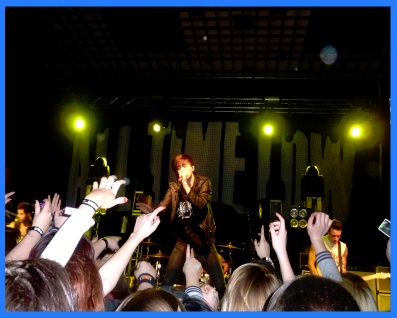
I used this image for my cover page, but decided that it looked too dull and not vibrant enough for a cover image. Therefore on Photoshop I edited this image so make it look like this ->
By changing the levels I made the background appear more black and changing the contrast made the picture look more colourful. This made the overall cover image look more attractive to its audience.


I used a variety of images on my front cover so I needed to make sure they looked professional. For this image, I decided to again change the levels to make the background look more black and then I adjusted the contrast to bring out the bright colours such as red. To make the picture stand out from my cover image, I added a blue border to it, to contrast with the dark colours of the cover image. Then I added a shadow to add some depth to the image. The transformation can be seen in this picture ->

I did the same to the other pictures I used on my magazine cover which can be seen here..

 For this image, I cropped out the unecessary space on the left side of the image. I then changed the levels, the contrast and the brightness level to make the picture not seem dull. I added a glow to this image to set it apart from the rest and achieved this by employing a different border colour.

On my contents page, because I wanted to keep the focus on the information on the page, I decided that having colourful images would distract the reader from what I want them to see. Therefore, I changed all my images on my contents to black and white on Photoshop like this ->


I did the same to the other pictures I used on my magazine contents which can be seen here..


I used this picture on my double page spread as the main focus for the article. I wanted the picture to look attractive because the article is based on the band in this picture. Therefore, I adjusted the levels to make the black and red colours in the image stand out more and make it look more professional than it originally looked.

 I also used this picture on my double page spread on the article side. I decided that I didn't want to take the focus away from the information so i changed the picture effect to black and white. I didn't want the page to look too dull though so to fit in with the colour scheme I added a purple glow to it.
Subscribe to:
Comments (Atom)